
The language of photography — there is at least one, perhaps there are many, but let’s assume just one with many variants or dialects — it is so rich, so full of possibilities for narration and poetry, providing understanding, joy and fear and so many other flavored feelings. I’m getting more and more proficient in using it, but at the same time I’m constantly looking for natural language equivalents or feel-alikes which ease the way of one language into the other. In my natural, native language I feel capable of expressing virtually anything. And hence I’m looking for words to describe how my pictures are composed, what rules they follow and what the aesthetics are which they instantiate on paper or on screen.
For the last months I was hooked to the term „pencil aesthetics“ — some of my pictures lacking jet blacks reminded me of pencil drawings. I liked the idea since I’ve always liked pencil drawings, so I went for that term and thought it would carry the series of pictures.
But wrong I was. I was carried away, away from my visual understanding of the coherence of the emerging series of pictures. Although the pictures felt right, with that label on them I was forced to match the picture with the idea of a pencil drawing and sometimes concluded a failure - but for wrong: they visually still felt right and in line with the look of the series I have in mind. So I told myself to step back and have a fresh look on the series and my natural language label for it.
It’s the visual language that has to be sound, that has to feel right and consistent. The natural language should come as close as possible to the visual language concept, not vice versa. It shouldn’t become a restriction, it is just meant for easing the way, not for narrowing the view.
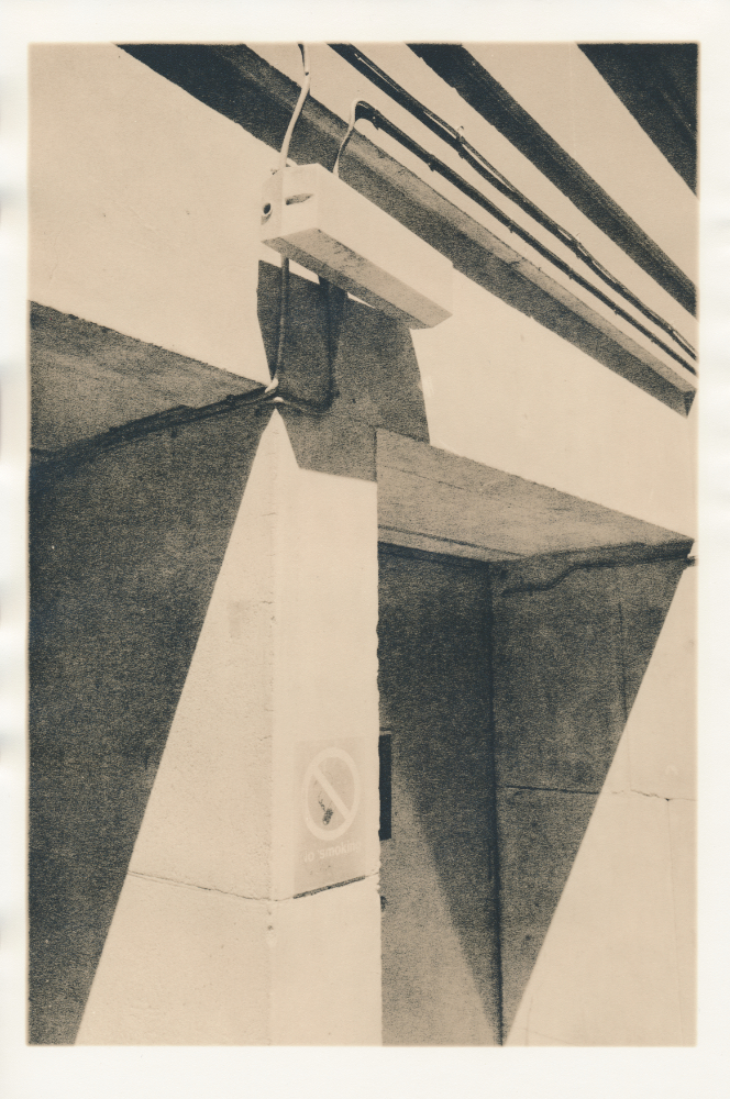
So I rediscovered my pictures, reconsidered how to translate them and their aesthetics. What I found out is that it was not the lack of blacks that defined them, their aesthetics wasn’t just grey on grey. It’s more the medium greys full of luminous grain, it’s more the feel of shadows breathing light which strike a common chord. What they all share is that they are somewhat dominated by homogeneous areas of medium and grainy greys which are like eye-candy to me, especially on velvety-surfaced paper.
Luminous grain? Well, grain is an artefact that is sometimes taken as the signature look for analogue photography in the sense of the hashtag #grainisgood. But that’s not what I’m talking about here, that’s not what I’m intending. To make that visually clear, each picture clearly has grainless and sharp areas which defy the tale of the grainy and pure analog aesthetics. That shall make clear to the viewer that the grain is meant to carry luminescence in certain areas instead of an overall, general retro-feel.
Will that term „luminous grain“ hold up and carry the series? Dunno yet. It’s a working title. Visual language first. I’ll see over time if I have to adjust that working title, if it still feels right. Today it does.